collection filters
Filter the collection of images displayed in the lighttable view and filmstrip panel using image attributes, optionally pinning filters to the top panel for quick access.
Once you have defined a collection of images with the collections module, the collection filters module allows you to define additional filters and sort criteria. For example, you might wish to show all images in a given folder using the collections module and then define additional quick filters to narrow-down by star rating and/or color label.
🔗filtering attributes
For information about the image attributes you can select, please see the documentation for the collections module.
Note that only a subset of filters is currently implemented – more will be added in future versions of darktable.
🔗default settings
By default, three filters (range rating, color label and text search are defined within this module. By default these filters select all images (i.e. show images with any star rating or color label) and are all pinned to the top panel for quick access. This default setting is also available as the “initial setting” preset.
🔗module controls
🔗adding new filters
To add a new filter to the module, click on the “new rule” button and select an image attribute to use.
🔗combining multiple filters
When you use multiple filters, the first item on the filter header allows you to define how the filter is combined with the previous one.
- and
- Narrow down search. An image is only retained if it also fulfills the new criteria.
- or
- Add more images. Images from the collection that fulfill the new criteria are added.
- and not
- Exclude images. Images that fulfill the new criteria are removed.
Note: The and/or/not operators have a defined order of precedence such that “not” is executed first, then “and” and finally “or”. This means, for example, that if you define complex filters like “A and B or C and not D” these will be implemented as “(A and B) or (C and (not D))”.
🔗removing or deactivating filters
You can remove or temporarily deactivate a specific filter using the buttons on the right of the filter header (see screenshots in the following sections). If a filter is pinned to the top panel, you will need to unpin it before removing or deactivating.
🔗pinning into the top toolbar
The pin button on the right of the filter header allows you to pin a filter to the top panel. To avoid unwanted actions, pinned filters can’t be removed or deactivated.
🔗resetting filters
Clicking on the module reset button will remove all un-pinned filters and reset all others to their default values. If you want to also remove the pinned filters, you can Ctrl+click on the reset button.
🔗returning to a previous set of filters
You can return to a previously-defined set of filters by clicking on the history button at the bottom of the module and selecting from the resulting list.
🔗filter widgets
A number of filter widgets have been created for use within this module. Since some of these widgets use non-standard interfaces, their usage is explained in the following sections:
🔗color labels
The following image shows the color labels widget, set to filter images having yellow or green color labels:
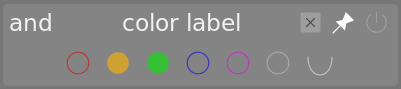
You can interact with this filter widget as follows:
- Click on a color label to include images with that label
- Ctrl+click on a color label to include images without that label
- Click or Ctrl+click on the gray icon to act on all color labels simultaneously
- Use the last button to define how to handle the selection of multiple color labels. Select
 (and) to filter images having all of the selected color labels; Select
 (or) to filter images with at least one of the selected color labels.
🔗rating
This is the classic rating selection widget that used to be shown in darktable’s top panel by default.
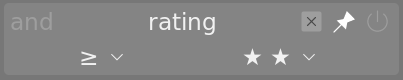
This widget is composed of a pair of comboboxes. The combobox on the right (always visible) is used to choose a number of stars, plus some additional options (“all”, “unstarred only”, “rejected only”, “all except rejected”). The combobox to the left (only shown when a star rating is chosen in the right-hand combobox) is used to choose an operator (<, <=, =, >, >=, ≠).
🔗range rating
This new widget also allows you to select images by star rating, this time using a new “range” widget. The following image shows the widget with ratings of 2-4 stars selected.
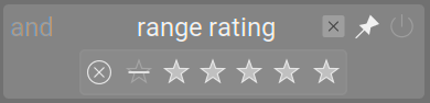
You can choose a new range of ratings to filter by clicking and dragging over the widget’s interface. You can also access pre-defined ranges by right-clicking and selecting from the popup menu. The number of applicable images is also shown against each entry in this menu.
🔗range filters for numeric attributes
Numeric attributes (aperture, exposure, focal length, iso, aspect ratio) are filtered using a widget that shows a histogram of the number of images available depending on the value of the given attribute (similar to the timeline in the lighttable view).
For example, the following image shows the widget when used for selecting by aperture:
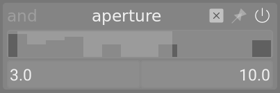
As with the range rating filter, you can select a range of values to filter by clicking and dragging on the widget. You can also access predefined ranges by right-clicking and selecting from the popup menu. The number of applicable images is also shown against each entry in this menu.
You can also use the “min” and “max” text entry fields in the main module interface to manually define the bounds of the selection.
🔗date attributes
As with numeric and rating range filters, date/time filters are represented using a “range” widget. You can select a range of values by clicking and dragging on the widget, and use the right-click menu for more options.
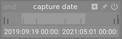
You can also use the “min” and “max” text entry fields in the main module interface to manually define the bounds of the selection (right-click for more options).
The date/time format used by this module is YYYY:MM:DD HH:MM:SS (only the year values are mandatory).
The keyword now is allowed in the max field (to define the current date/time).
You can also use “relative” date/time values by preceding text entries with + or -. This allows you to set the maximum or minimum bound of the range relative to the other bound. As an example if you set the min value to -0000:01 and the max value to 2022:04:15, this will select images taken during the month before April 15th 2022.
🔗filename
The filename filter allows you to search images by their filename and/or extension. You can either enter the name or extension (with the leading .) manually or use the right-click menu to select.
Within the extension field, you can also use the keywords RAW (to select all handled RAW file extensions), NOT RAW (to select all non-RAW file extensions), LDR (to select low-dynamic-range extensions) or HDR (to select high-dynamic-range extensions).
🔗camera, lens
The camera and lens filters are presented text entry fields into which you can enter text to filter by. Alternatively, you can right-click on the text box to see a list of cameras or lenses to select from.
🔗text search
You can search images using any of their text properties (path, filename, filmroll, tags, metadata, camera, maker) using the text search filter. The search is performed “on-the-fly” and the widget is dimmed during the search process.
By default darktable performs a “fuzzy” search (wildcards are automatically added to the start and the end of the text). If you want to search for an exact match, you can enclose it with double-quotes ("match this exactly").
🔗sorting
The bottom part of the module allows you to define the sort order of the images when displayed in the lighttable and filmstrip views. As with the filter criteria, you can add multiple rules to this section. However, only the first-selected sort criteria is pinned to the top panel (this cannot be unpinned).
As with filter criteria, the history button allows you to access any previously-used sort criteria.
The button to the right of the attribute selection allows you to choose whether to sort that criteria in ascending or descending order.
🔗custom sort
Setting the sort order to “custom sort” presents images in any sequence you define. Images are initally ordered by an image property (import order, image capture time, file name, etc.) but you can then incrementally alter “custom sort” sequences by dragging-and-dropping images within the lighttable view. Be careful: an erroneous drag-and-drop can easily ruin one or more painstakingly-created image sequences.
🔗warnings
Please bear the following warnings in mind when using custom sort
-
“Undo” does not reverse drag-and-drop resequencing.
-
Drag-and-drop resequencing is always enabled in lighttable filemanager and in the filmstrip, but any resulting changes are invisible if “custom sort” is not currently in effect.
-
Ensure any image you drag is not selected unless you want to reposition the entire currently-selected set.
-
Aim your “drops” accurately: verify the correct target is highlighted before dropping!
-
Custom sort positions are lost if images are removed from darktable or their tags are detached or deleted (since sort order is not stored in an image’s sidecar file).
-
Do not use “custom sort” for tag-based collections that specify a wild-card ("*" or “%”) expression.
When a wild-card tag expression does not resolve to a single tag, drag-and-drop operates only on the sequence of the first matching tag. If that tag is attached to a source image, that image is resequenced. If the same tag is also attached to the target image, the drop occurs there; if not, resequenced images appear at the top or bottom of the collection’s “custom sort”. If the first matching tag is not attached to a source image, the image is not repositioned. The “tag case sensitivity” preference is also relevant here: “insensitive” treats “%” (but not “*”) as a string-match wild card. The global sequence is not affected in any of these cases.
🔗which custom sort sequence?
The collection type determines which image sequence drag-and-drop changes. If the collection’s selection criteria includes tag, then a tag-based “custom sort” sequence is altered. Otherwise, the global “custom sort” sequence is altered. Collection filters (even if tag-based) do not influence which sequence is changed by drag-and-drop.
When “custom sort” is in effect, dragged-and-dropped images are immediately presented in their new (tag-based or global) “custom sort” sequence.
🔗what to drag, where to drop?
While viewing a collection in filemanager or the filmstrip, you may drag any hovered-over (highlighted) image to any other image in the displayed collection. Empty space before, between, or after images is not a recognized drop target.
You may relocate a single image (unselected or single selection) or a selected set of images by dragging one of them to the desired position as follows:
-
When sort order is “ascending” the dragged image/set will be placed before the image you drop it on to.
-
When sort order is “descending” the dragged image/set will be placed after the image you drop it on to.
-
Abort an accidental drag by dropping the dragged image outside of the thumbnail display. If all peripheral panels are hidden, then drop the dragged image on itself. If multiple images were selected, the entire selected set will be relocated to that spot.
-
If the “dropped on” image is subsequently resequenced, filtered out, or even deleted, the dropped image(s) remain where the “dropped on” image was located.
🔗which image is last (or, in descending sort, first)?
-
An image dropped after the last image on lighttable is regarded as dropped on the last image, thus positioned before it.
-
To change the last image in an “ascending” “custom sort” display, drop it on the existing last image, then drag-and-drop that last image on its intended replacement.
-
If you expect to use a “descending” sort, do the opposite to change the first image.
🔗suggested process
-
If you intend to present a collection in more than one “custom sort” sequence or if some images in a collection are included in other collections to be displayed with a different global “custom sort”, then tag-based collections should be used.
-
For tag-based “custom sort” only:
- Set sort by to the image attribute and sort order (ascending or descending) you want as your tag’s initial sequence,
- Select the images to be sequenced, and
- in the right-hand panel at tagging (bottom half) add a new tag or click on an existing tag.
- The tag is now attached to the selected images in the displayed sequence. Note the tag’s increased image count.
- Change collections selection crierion to “tag” and choose the newly-applied tag. Note that the newly-tagged images are shown.
-
Long-distance drags are difficult because neither filemanager nor filmstrip scroll while you drag. Try to fit drag sources and targets onto the same screen by maximizing the the window and scrolling the display. If that’s not sufficient:
- increase the number of images displayed (thus shrinking thumbnails) or
- hide images between drag source and drop target using collection filters (e.g. by ranges of “datetime captured” or “image id”).
-
Rearrange the images as you desire:
- Clear any active selection (selection > select none).
- Set sort by > “custom sort” so you can verify your changes immediately.
- Remember the warnings above as you drag-and-drop.